

The following design diary was written by the designer of Pyrotechnics, Michael Byron Sprague.
Hi, I’m Mike, and I’m the designer of the two-player resource-management dueling card game, Pyrotechnics. This is my first published design, and I’d like to share its journey from a pile of colored cards to the final form that’s now headed to your table.
First Prototype
The initial idea was “What if Raiders of the North Sea had a simpler resource system, but you used cards instead of workers on spaces?” I had intended this to be a multiverse-themed game for two to five players, but the first test was incredibly lackluster; to the point that I essentially said the project was dead. But that initial question would wind up driving a lot of the design going forward, once I settled on a new direction. Raiders already did something clever and interesting. How could I take that inspiration and make something similarly interesting?
Well, what if it became a resource-management euro game, condensed into a two-player dueling game? Bingo! Now we’re onto something. I settled on trying 18 cards, the color wheel for combos and some tokens to see how it felt. All three of those things would go on to be in the final product.
Humble Beginnings
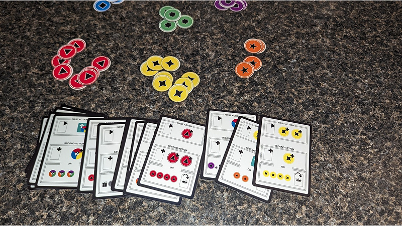
The game didn’t start as Pyrotechnics. In fact, the earliest incarnation of the two-player direction wasn’t even themed. Back then, it was just called Resourceful—a system of colors on cards that combined to form other colors. That was it. No setting, no story—just abstract resource manipulation. It worked. Even my eight-year-old daughter tested with me and loved it. The use of the color wheel to direct how the combinations were made was very intuitive. The gameplay loop (still present to this day) of playing a card from your hand and then playing one from the table also made for some interesting decisions. Additionally, winning was simple… just shed your hand.
There was one big snag, though: I have a minor color-vision impairment. For me, relying solely on colors was immediately frustrating and impractical. So I began to consider adding a theme.
The Fruit That Didn’t Ripen
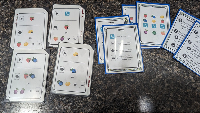
My first stab at a theme was fruit trading. At one point, I even gave the game a very specific name: Strawberry Banke—a little nod to a place near where I grew up, the Strawberry Banke Museum in Portsmouth, New Hampshire. The idea was charming on paper, but the logic fell apart in play. After all, why would trading a strawberry and a blueberry result in a grape? It felt arbitrary, and the theme never stuck. I knew I needed something but I didn’t want the lack of theme to slow down my momentum on playtesting, this was my fifth or sixth project and easily the one I had been most enamored by.
Accessibility Through Iconography
So I returned to the core concept of colors, but this time I solved the accessibility problem by layering in iconography. Red became a triangle, blue a square, etc, and if you put red and blue together they formed purple—a pentagon. This system not only made the game more accessible for color-blind players like myself, but it also gave the combinations a visual “click” that felt satisfying.
As the game grew, I extended this approach to sections of the cards and the actions as well, assigning them all icons to direct the game. This turned out to be a critical step toward making the game language-independent, which I wanted as a selling point for possible publishing. Now a quick icon guide had people gathering primary resources, exchanging them for secondary resources, and spending resources to score cards (among other things).
Testing, Testing, Testing
Before pitching, the game saw more than sixty tests. Most of these happened through Cardboard Commons, a fantastic online playtesting community that’s not only a treasure trove of feedback but also a place where I’ve formed lifelong friendships. Additionally, I did a lot of in-person testing with the Game Makers Guild out of Boston. It was during these tests that people suggested a version with points, and I even tested a version with the ability to trade in secondary resources for more powerful one-time actions. But I kept sticking with the initial design, iterating to make it more simple, not more advanced.
The gameplay was working—but when it came time to pitch to publishers, the lack of a theme was a sticking point. Abstract mechanics alone weren’t enough to stand out. I needed a theme that matched the system.
Sparks of a Theme
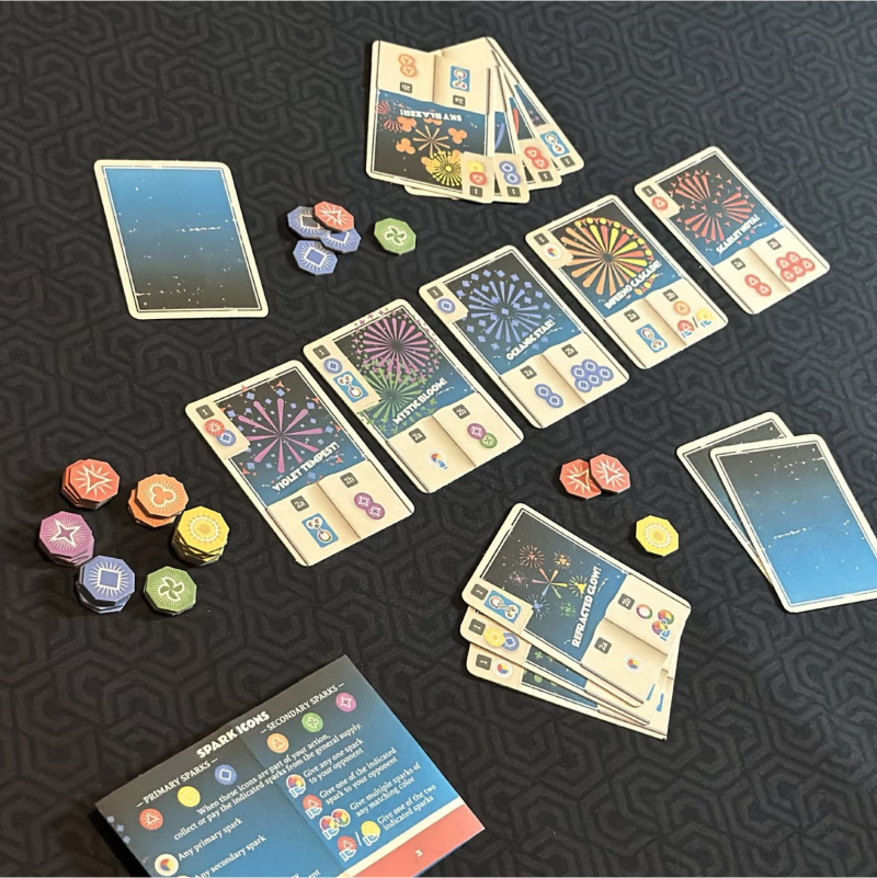
I brainstormed several possibilities, but the one that artist Gavin Pouliot suggested which ultimately clicked was fireworks. I imagined early pyrotechnic pioneers dueling to create dazzling displays while also learning from each other’s breakthroughs. The fireworks theme tied beautifully into the mechanics: limited resources, careful exchanges, and moments of explosive payoff. Additionally, he designed the resource icons (which would go on to be called “sparks”) in a way that they could be used in the art itself, bringing the firework theme full circle.
With the new theme in place, I polished up the prototype and brought it to Metatopia. There, playtests revealed some small balance issues—mostly related to cost. These were easy enough to fix, and after a few more rounds with Cardboard Commons, and with a new name, Pyrotechnics was in its strongest state yet.

Meeting with Katz
Around this time, Katz (who I met through playtesting and who is the creator of Cardboard Commons) and I had a conversation about his new venture. He was thinking of starting a publishing company and was even interested in publishing more than just his games. I offered to pitch him the game, and he was intrigued. We had a virtual handshake agreement and then we met at Unpub, where he got to play the updated fireworks version. By the end of the weekend, we had a physical handshake agreement. Pyrotechnics was on its way to becoming a real product.

Streamlining for a Wider Audience
Shortly after Unpub, I signed the contract. At this point, I thought the game was finished (spoiler: I was wrong). I had done some unguided testing prior to signing, but additional unguided testing found some areas where improvements could be made. Certain icons and systems were stumbling blocks. Together, Katz and I realized that trimming complexity could actually open the game to a broader audience without sacrificing tactical depth.
Several icons were cut:
- Discounted exchanges → replaced with a wild spark and an exchange (effectively the same thing)
- Swapping → removed entirely, since it was rarely used
- Multi-exchange → replaced with two single exchange icons, since players almost never did more than two anyway
The result was a cleaner system: fewer icons, but the same flexibility and tactical richness. The resource economy also became sharper and more intuitive.
The Final Stretch
From there, Katz took the lead on refining layout, rules presentation, and player guides (along with all the other publisher duties, Katz is a rockstar!). He made sure the rulebook and iconography were crystal clear, while I gave feedback from a designer’s perspective and did some more unguided testing. What emerged was the version you’ll find in your box: a lean, accessible, and thematic duel of sparks and strategy.
Closing Thoughts
Designing Pyrotechnics has been a journey of accessibility, community, and collaboration. It was also a journey of staying true to the initial design intent. Several times I could have pivoted and added in additional systems or point scoring, but I stuck to a shedding mechanism and just eighteen cards with tokens. As a result of that design intent, what began as a color-matching experiment inspired by the color wheel became a duel of fireworks, shaped by countless testers, sharpened through iteration, and brought to life by Katz’s publishing vision.
I’m thrilled to see it out in the world, and I hope that when you sit down to play, you’ll feel the same sparks of excitement that kept me chasing this design through all its iterations.
Thanks for reading, and thanks for playing!
– Mike